A collection of draggable panel UI components and sparkline charts built as Lit web components.
Based on the magx project by mlalma —
I liked the components enough to build them into a library I could use for my own webapps. 1.1.0.25037
16 Components
TypeScript
Lightweight
Web Components
Panel with all element types Sparkline chart variations The main container component. A draggable, collapsible floating panel that groups child elements into a unified HUD-style interface. Supports positioning, z-index management, serialization of all child values to/from JSON, and native haptic feedback on mobile (iOS Safari 18+ via switch checkbox, Android via navigator.vibrate).
Name Type Default Description idStringauto-generatedUnique identifier for the panel titleString""Title displayed in the title bar xNumber0Initial X position (attribute only) yNumber0Initial Y position (attribute only) outofboundsBooleantrueRestrict panel to parent bounds closebuttonBooleantrueShow close button in title bar
Haptic Feedback — Panel components provide native haptic feedback on mobile devices. iOS (Safari 18+): uses transparent <input switch> overlays — tapping buttons, checkboxes, inputs, color pickers, date/time pickers, and dropdowns triggers the Taptic Engine via real touch on a switch checkbox wrapped in a label. Android : uses navigator.vibrate() with PWM intensity modulation. Known limitation: range slider drag haptics are not yet supported on iOS — the switch checkbox approach requires discrete taps and cannot fire during continuous drag gestures.
<magx-panel id="my-panel" title="Settings" x="50" y="50">
  <magx-panel-textinput title="Name" placeholder="Enter name..."></magx-panel-textinput>
  <magx-panel-range title="Volume" min="0" max="100" step="1" value="50"></magx-panel-range>
  <magx-panel-button title="Apply"></magx-panel-button>
</magx-panel> const panel = new MagxPanel();
panel.title = "My Panel";
const input = new MagxPanelTextInput();
input.title = "Name";
panel.appendChild(input);
document.body.appendChild(panel);
panel.setPosition(50, 50); A toggle checkbox element. Returns a boolean value indicating checked state.
Name Type Default Description titleString""Label text checkedBooleanfalseInitial checked state (attribute) idStringauto-generatedUnique identifier
<magx-panel-checkbox title="Enable Feature" id="chk1" checked></magx-panel-checkbox> A color selection element. Displays a color preview swatch and allows picking a new color via the native color input.
Name Type Default Description titleString""Label text valueString"#000000"Initial hex color value idStringauto-generatedUnique identifier
<magx-panel-colorpicker title="Background" id="cp1" value="#7c3aed"></magx-panel-colorpicker> A date picker element that uses the native HTML date input. Returns the selected date as a string.
Name Type Default Description titleString""Label text idStringauto-generatedUnique identifier
<magx-panel-date title="Start Date" id="date1"></magx-panel-date> A dropdown select element. Options can be defined via HTML option elements or set programmatically. Returns the selected index and label.
Name Type Default Description titleString""Label text indexNumber0Initially selected option index idStringauto-generatedUnique identifier
<magx-panel-dropdown title="Mode" id="dd1" index="0">
  <option label="Easy">Easy</option>
  <option label="Normal">Normal</option>
  <option label="Hard">Hard</option>
</magx-panel-dropdown> const dropdown = document.getElementById('dd1');
dropdown.setOptions(['Red', 'Green', 'Blue'], 1); A file selection element. Displays the chosen filename and provides access to the File object.
Name Type Default Description titleString""Label text placeholderLabelString""Text shown when no file selected idStringauto-generatedUnique identifier
<magx-panel-filechooser title="Upload" id="fc1" placeholderLabel="Choose a file..."></magx-panel-filechooser> Allows embedding arbitrary HTML content inside a panel. Content is provided via slotted children.
Name Type Default Description titleString""Label text idStringauto-generatedUnique identifier
Bold , italic , and underlined text
<magx-panel-html title="Custom Content" id="html1">
  <p style="color: red;">Any <b>HTML</b> here</p>
</magx-panel-html> Displays an image inside the panel. The image URL can be set via attribute or programmatically.
Name Type Default Description titleString""Label text srcString""Image URL (attribute) idStringauto-generatedUnique identifier
<magx-panel-image title="Preview" id="img1" src="./photo.jpg"></magx-panel-image> A visual progress bar. Set current and max values to display progress percentage.
Name Type Default Description titleString""Label text currentValueNumber0Current progress value maxValueNumber100Maximum value idStringauto-generatedUnique identifier
<magx-panel-progressbar title="Loading" id="pb1" currentValue="65" maxValue="100"></magx-panel-progressbar> const bar = document.getElementById('pb1');
bar.currentValue = 75; // Updates visually A slider input element. Displays the current numeric value and allows dragging to change it within min/max bounds.
Name Type Default Description titleString""Label text minNumber0Minimum value maxNumber10Maximum value stepNumber1Step increment valueNumber0Current value idStringauto-generatedUnique identifier
<magx-panel-range title="Volume" id="rng1" min="0" max="100" step="5" value="50"></magx-panel-range> A sparkline chart embedded inside a panel element. Wraps the standalone Sparkline component for use within the Panel system.
Name Type Default Description titleString""Label text idStringauto-generatedUnique identifier
<magx-panel-sparkline title="CPU Usage" id="spark1"></magx-panel-sparkline> A multi-line text input area. Supports placeholder text and returns the current content.
Name Type Default Description titleString""Label text placeholderString""Placeholder text valueString""Initial text content (attribute) idStringauto-generatedUnique identifier
<magx-panel-textarea title="Notes" id="ta1" placeholder="Type here..."></magx-panel-textarea> A single-line text input. Supports text, number, and password modes with optional min/max validation for numbers.
Name Type Default Description titleString""Label text typeString"text""text", "number", or "password" placeholderString""Placeholder text valueString""Initial value (attribute) maxlengthNumber524288Maximum character length minNumberMIN_VALUEMin value (number type only) maxNumberMAX_VALUEMax value (number type only) idStringauto-generatedUnique identifier
<magx-panel-textinput title="Username" id="ti1" placeholder="Enter name..." type="text"></magx-panel-textinput> A time picker element using the native HTML time input. Returns the selected time string.
Name Type Default Description titleString""Label text idStringauto-generatedUnique identifier
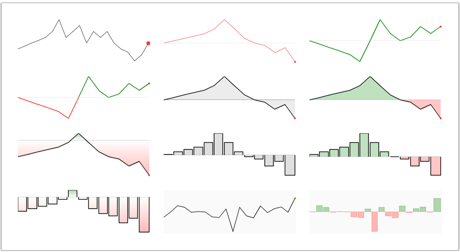
<magx-panel-time title="Alarm" id="time1"></magx-panel-time> A standalone canvas-based sparkline component. Supports line charts, bar charts, area fills, reference lines, endpoints, and gradient coloring. Highly configurable with 30+ options for rendering style, bounds, and data management.
Name Type Default Description widthNumber200Canvas width in pixels heightNumber50Canvas height in pixels
<magx-sparkline id="chart1" style="width: 200px; height: 60px;"></magx-sparkline> const spark = document.getElementById('chart1');
spark.setDataPointNum(30);
spark.setSparklineType(SparklineType.Line);
spark.setLine(Linetype.Straight, 2, { r: 50, g: 50, b: 50, a: 1.0 });
for (let i = 0; i < 30; i++) {
spark.addDataPoint(Math.random() * 100);
}
spark.renderCanvas(); Font Awesome Pro 6.5.1 with thin, light, regular, solid, sharp, and duotone families.
Browse the full catalog at the Font Awesome Explorer .
360-degrees abacus accent-grave acorn air-conditioner airplay alarm-clock alarm-exclamation alarm-plus alarm-snooze album album-circle-plus album-circle-user album-collection album-collection-circle-plus album-collection-circle-user alicorn alien alien-monster align-center align-justify align-left align-right align-slash alt amazon-pay amp-guitar ampersand anchor anchor-circle-check anchor-circle-exclamation anchor-circle-xmark anchor-lock angel angle angle-90 angle-down angle-left angle-right angle-up angles-down angles-left angles-right angles-up angles-up-down ankh apartment aperture apostrophe app-store-ios apper apple-core apple-crate apple-pay apple-whole archway arrow-down arrow-down-from-arc arrow-down-from-dotted-line arrow-down-left arrow-down-left-and-arrow-up-right-to-center arrow-down-right arrow-down-to-arc arrow-down-to-bracket arrow-down-to-dotted-line arrow-down-to-square arrow-down-up-across-line arrow-down-up-lock arrow-from-top arrow-left arrow-left-from-arc arrow-left-from-line arrow-left-long-to-line arrow-left-to-arc arrow-progress arrow-right arrow-right-from-arc arrow-right-from-line arrow-right-long-to-line arrow-right-to-arc arrow-right-to-city arrow-to-bottom arrow-to-left arrow-to-right arrow-trend-down arrow-trend-up arrow-turn-down-left arrow-turn-down-right arrow-turn-left arrow-turn-left-down arrow-turn-left-up arrow-turn-right arrow-up arrow-up-from-arc arrow-up-from-bracket arrow-up-from-dotted-line arrow-up-from-ground-water arrow-up-from-line arrow-up-from-square arrow-up-from-water-pump arrow-up-left arrow-up-left-from-circle arrow-up-right arrow-up-right-and-arrow-down-left-from-center arrow-up-right-dots arrow-up-to-arc arrow-up-to-dotted-line arrow-up-to-line arrows arrows-cross arrows-down-to-line arrows-down-to-people arrows-from-dotted-line arrows-from-line arrows-left-right arrows-left-right-to-line arrows-rotate-reverse arrows-spin arrows-split-up-and-left arrows-to-circle arrows-to-dot arrows-to-dotted-line arrows-to-eye arrows-to-line arrows-turn-right arrows-turn-to-dots arrows-up-to-line arrows-v asterisk asymmetrik at atom atom-simple audible audio-description audio-description-slash austral-sign autoprefixer avianex aviato avocado award award-simple axe axe-battle baby backpack backward bacon bacteria bacterium badge badge-check badge-dollar badge-percent badge-sheriff badger-honey badminton bag-seedling bag-shopping-minus bag-shopping-plus bagel bags-shopping baguette baht-sign ball-pile balloon balloons ballot ballot-check banana bandage bangladeshi-taka-sign banjo barcode barcode-read barcode-scan bars-filter bars-sort baseball baseball-bat-ball basket-shopping-minus basket-shopping-plus basketball basketball-hoop bat bathtub battery battery-bolt battery-empty battery-exclamation battery-half battery-low battery-quarter battery-slash battery-three-quarters battle-net bed bed-bunk bed-empty bed-front bee beer beer-mug bell bell-exclamation bell-on bell-plus bell-ring bell-school bell-school-slash bell-slash bells bench-tree bezier-curve bicycle billboard bimobject bin-bottles bin-bottles-recycle bin-recycle binary binary-circle-check binary-lock binary-slash binoculars biohazard bird bitcoin-sign bity black-tie blackberry blanket blanket-fire blender blender-phone blinds blinds-open blinds-raised block block-question block-quote blog blogger-b blueberries bluetooth-b bold bolt-auto bolt-lightning bolt-slash bomb bone bone-break bong book book-arrow-right book-arrow-up book-atlas book-bible book-blank book-bookmark book-circle-arrow-right book-circle-arrow-up book-copy book-font book-heart book-medical book-open book-open-cover book-reader book-section book-skull book-spells book-user bookmark bookmark-slash books books-medical boombox boot boot-heeled booth-curtain border-all border-bottom border-center-h border-center-v border-inner border-left border-none border-outer border-right border-style-alt border-top border-top-left bore-hole bots bottle-droplet bottle-water bow-arrow bowl-chopsticks bowl-chopsticks-noodles bowl-food bowl-rice bowl-scoops bowl-shaved-ice bowl-soft-serve bowl-spoon bowling-ball bowling-ball-pin bowling-pins box box-archive box-ballot box-check box-circle-check box-heart box-open box-open-full box-taped box-tissue box-usd boxes boxes-packing bracket bracket-curly bracket-curly-right bracket-round-right bracket-square-right brackets brackets-curly braille brain brain-circuit brake-warning brave brave-reverse brazilian-real-sign bread-loaf bread-slice bread-slice-butter bridge bridge-circle-check bridge-circle-exclamation bridge-circle-xmark bridge-lock bridge-suspension bridge-water briefcase briefcase-arrow-right briefcase-blank briefcase-medical brightness brightness-low bring-forward bring-front broccoli broom broom-wide browser browsers brush btc bucket bug bug-slash bugs building building-circle-arrow-right building-circle-check building-circle-exclamation building-circle-xmark building-flag building-lock building-magnifying-glass building-memo building-ngo building-shield building-un building-user building-wheat buildings bulldozer bullhorn bullseye bullseye-arrow bullseye-pointer buoy buoy-mooring burger-fries burger-glass burger-lettuce burger-soda burrito burst bus bus-school bus-simple business-time butter buy-n-large buysellads cabin cabinet-filing cactus cake calculator calculator-simple calendar calendar-check calendar-circle-exclamation calendar-circle-minus calendar-circle-plus calendar-circle-user calendar-day calendar-days calendar-download calendar-exclamation calendar-heart calendar-image calendar-lines-pen calendar-minus calendar-note calendar-pen calendar-plus calendar-range calendar-star calendar-time calendar-upload calendar-users calendar-week calendar-xmark calendars camera camera-movie camera-polaroid camera-retro camera-rotate camera-security camera-slash campfire campground can-food cancel candle-holder candy candy-cane candy-corn cannabis cannon capsules car car-battery car-bolt car-building car-bump car-bus car-circle-bolt car-crash car-garage car-mirrors car-on car-rear car-side car-side-bolt car-tilt car-tunnel car-wash car-wrench caravan caravan-simple card-club card-diamond card-heart card-spade cards cards-blank caret-down caret-left caret-right caret-up carriage-baby carrot cars cart-arrow-down cart-arrow-up cart-circle-arrow-down cart-circle-arrow-up cart-circle-check cart-circle-exclamation cart-circle-plus cart-circle-xmark cart-minus cart-plus cart-shopping-fast cart-xmark cash-register cassette-betamax cassette-tape castle cat cat-space cauldron cctv cedi-sign cent-sign centercode centos certificate chair chair-office chalkboard chalkboard-user charging-station chart-area chart-bar chart-bullet chart-candlestick chart-column chart-gantt chart-kanban chart-line-down chart-line-up chart-line-up-down chart-mixed chart-mixed-up-circle-currency chart-mixed-up-circle-dollar chart-network chart-pie-simple chart-pie-simple-circle-currency chart-pie-simple-circle-dollar chart-pyramid chart-radar chart-scatter chart-scatter-3d chart-scatter-bubble chart-simple chart-simple-horizontal chart-tree-map chart-waterfall check check-double cheese cheese-swiss cheeseburger cherries chess chess-bishop chess-bishop-piece chess-board chess-clock chess-clock-flip chess-king chess-king-piece chess-knight chess-knight-piece chess-pawn chess-pawn-piece chess-queen chess-queen-piece chess-rook chess-rook-piece chestnut chevron-down chevron-left chevron-right chevron-up chevrons-down chevrons-left chevrons-right chevrons-up chf-sign child child-dress child-reaching child-rifle children chimney chocolate-bar chopsticks chromecast church circle circle-0 circle-1 circle-2 circle-3 circle-4 circle-5 circle-6 circle-7 circle-8 circle-9 circle-a circle-ampersand circle-arrow-down circle-arrow-down-left circle-arrow-down-right circle-arrow-left circle-arrow-right circle-arrow-up circle-arrow-up-left circle-arrow-up-right circle-b circle-bolt circle-book-open circle-bookmark circle-c circle-calendar circle-camera circle-caret-down circle-caret-left circle-caret-right circle-caret-up circle-check circle-chevron-down circle-chevron-left circle-chevron-right circle-chevron-up circle-d circle-dashed circle-divide circle-down circle-down-left circle-down-right circle-e circle-ellipsis circle-ellipsis-vertical circle-euro circle-exclamation-check circle-f circle-g circle-half circle-half-stroke circle-i circle-j circle-k circle-l circle-left circle-m circle-n circle-nodes circle-notch circle-o circle-p circle-q circle-quarter circle-quarter-stroke circle-quarters circle-r circle-right circle-s circle-small circle-sterling circle-t circle-three-quarters circle-three-quarters-stroke circle-u circle-up circle-up-left circle-up-right circle-v circle-w circle-x circle-y circle-yen circle-z circles-overlap citrus citrus-slice city clapperboard clapperboard-play clarinet claw-marks clipboard clipboard-check clipboard-list clipboard-list-check clipboard-medical clipboard-prescription clipboard-question clipboard-user clock clock-desk clock-eight clock-eight-thirty clock-eleven clock-eleven-thirty clock-five clock-five-thirty clock-four-thirty clock-nine clock-nine-thirty clock-one clock-one-thirty clock-seven clock-seven-thirty clock-six clock-six-thirty clock-ten clock-ten-thirty clock-three clock-three-thirty clock-twelve clock-twelve-thirty clock-two clock-two-thirty clone closed-captioning closed-captioning-slash clothes-hanger cloud cloud-binary cloud-check cloud-download cloud-drizzle cloud-exclamation cloud-hail cloud-hail-mixed cloud-meatball cloud-minus cloud-moon cloud-moon-rain cloud-music cloud-plus cloud-question cloud-rain cloud-rainbow cloud-showers cloud-showers-heavy cloud-showers-water cloud-slash cloud-sleet cloud-snow cloud-sun cloud-sun-rain cloud-upload cloud-word cloud-xmark clouds clouds-moon clouds-sun cloudscale cloudsmith cloudversify clover club cmplid coconut code code-branch code-commit code-compare code-fork code-merge code-pull-request code-pull-request-closed code-pull-request-draft code-simple codiepie coffee-bean coffee-beans coffee-pot coffin coffin-cross coin coin-blank coin-front coin-vertical coins colon colon-sign columns-3 comet comma command comment comment-arrow-down comment-arrow-up comment-arrow-up-right comment-captions comment-check comment-code comment-dollar comment-exclamation comment-heart comment-image comment-lines comment-medical comment-middle comment-middle-top comment-minus comment-music comment-pen comment-plus comment-question comment-quote comment-slash comment-smile comment-text comment-xmark commenting comments comments-dollar comments-question comments-question-check compact-disc compass compass-slash compress compress-arrows compress-wide computer computer-classic computer-speaker concierge-bell confluence connectdevelop contact-book container-storage contao conveyor-belt conveyor-belt-arm conveyor-belt-boxes conveyor-belt-empty cookie cookie-bite copy copyright corn corner cotton-bureau couch court-sport cow cowbell cowbell-more cpanel crab crate-apple crate-empty creative-commons creative-commons-by creative-commons-nc creative-commons-nc-eu creative-commons-nc-jp creative-commons-nd creative-commons-pd creative-commons-pd-alt creative-commons-remix creative-commons-sa creative-commons-sampling creative-commons-sampling-plus creative-commons-share creative-commons-zero credit-card credit-card-blank credit-card-front cricket critical-role croissant crop crop-simple cross crosshairs crosshairs-simple crow crown crutch crutches cruzeiro-sign crystal-ball css3-alt cube cubes cubes-stacked cucumber cup-straw cup-straw-swoosh cup-togo cupcake curling custard cuttlefish d-and-d d-and-d-beyond dagger dailymotion dashcube database debian debug deer deer-rudolph delete-left delete-right delicious democrat deploydog deskpro desktop desktop-arrow-down deviantart dharmachakra dhl diagram-cells diagram-lean-canvas diagram-nested diagram-next diagram-predecessor diagram-previous diagram-sankey diagram-subtask diagram-successor diagram-venn dial dial-high dial-low dial-max dial-med dial-med-low dial-min dial-off diamond diamond-exclamation diamond-half diamond-half-stroke diaspora dice dice-d10 dice-d12 dice-d20 dice-d4 dice-d6 dice-d8 dice-five dice-four dice-one dice-six dice-three dice-two digg dinosaur directions disc-drive discourse disease display display-arrow-down display-chart-up display-chart-up-circle-currency display-chart-up-circle-dollar display-code display-medical display-slash distribute-spacing-horizontal distribute-spacing-vertical ditto divide dna do-not-enter dochub dog dog-leashed dolly dolly-empty dolly-flatbed dolly-flatbed-alt dolly-flatbed-empty dolphin donate dong-sign door-closed door-open dot-circle doughnut dove down down-from-dotted-line down-from-line down-left down-left-and-up-right-to-center down-right down-to-bracket down-to-dotted-line down-to-line download draft2digital drafting-compass dragon draw-circle draw-polygon draw-square dreidel drone drone-front droplet-degree drum drum-steelpan drumstick drumstick-bite drupal dryer dryer-heat duck dumbbell dumpster dumpster-fire dungeon dyalog ear ear-listen ear-muffs earlybirds ebay eclipse edge-legacy egg egg-fried eggplant eject elementor elephant elevator ellipsis ellipsis-stroke ellipsis-v-alt ellipsis-vertical ello empire empty-set engine engine-warning envelope envelope-circle envelope-circle-check envelope-dot envelope-open envelope-open-dollar envelope-open-text envelopes equals eraser erlang escalator ethernet etsy euro excavator exchange exclamation exclamation-circle expand expand-arrows expand-wide expeditedssl explosion external-link eye eye-dropper-full eye-dropper-half eye-evil eye-slash eyedropper eyes face-angry face-angry-horns face-anguished face-anxious-sweat face-astonished face-beam-hand-over-mouth face-clouds face-confounded face-confused face-cowboy-hat face-diagonal-mouth face-disappointed face-disguise face-dizzy face-dotted face-downcast-sweat face-drooling face-exhaling face-explode face-expressionless face-eyes-xmarks face-fearful face-frown-slight face-glasses face-hand-over-mouth face-hand-peeking face-hand-yawn face-head-bandage face-holding-back-tears face-hushed face-icicles face-kiss-closed-eyes face-lying face-mask face-melting face-monocle face-nauseated face-nose-steam face-party face-pensive face-persevering face-pleading face-pouting face-raised-eyebrow face-relieved face-sad-sweat face-saluting face-scream face-shush face-sleeping face-sleepy face-smile-halo face-smile-hearts face-smile-horns face-smile-relaxed face-smile-tear face-smile-tongue face-smile-upside-down face-smiling-hands face-smirking face-spiral-eyes face-sunglasses face-swear face-thermometer face-thinking face-tissue face-tongue-money face-tongue-sweat face-unamused face-viewfinder face-vomit face-weary face-woozy face-worried face-zany face-zipper facebook-f facebook-messenger falafel family family-dress family-pants fan fan-table fantasy-flight-games farm fast-backward faucet faucet-drip fax feather feather-pointed fedex fedora fence ferris-wheel ferry field-hockey file file-audio file-binary file-certificate file-chart-line file-chart-pie file-check file-circle-check file-circle-exclamation file-circle-info file-circle-minus file-circle-plus file-circle-question file-circle-xmark file-code file-contract file-csv file-doc file-download file-eps file-excel file-exclamation file-export file-gif file-heart file-image file-import file-invoice file-invoice-dollar file-jpg file-lock file-medical file-minus file-mov file-mp3 file-mp4 file-music file-pdf file-pen file-plus file-plus-minus file-png file-powerpoint file-ppt file-prescription file-search file-shield file-signature file-slash file-spreadsheet file-svg file-text file-upload file-user file-vector file-video file-waveform file-word file-xls file-xmark file-xml file-zip file-zipper files files-medical fill fill-drip film film-cannister film-simple film-slash films filter filter-circle-xmark filter-list filter-slash filters fingerprint fire fire-burner fire-extinguisher fire-flame-curved fire-flame-simple fire-hydrant fire-smoke firefox-browser fireplace firewall first-order first-order-alt firstdraft fish fish-bones fish-cooked fish-fins fishing-rod flag flag-checkered flag-swallowtail flag-usa flame flashlight flask flask-gear flask-round-poison flask-round-potion flask-vial flatbread flatbread-stuffed flipboard floppy-disk-pen floppy-disks florin-sign flower flower-daffodil flower-tulip flushed flute flux-capacitor flying-disc fog folder folder-bookmark folder-check folder-closed folder-download folder-gear folder-grid folder-heart folder-image folder-medical folder-minus folder-music folder-open folder-plus folder-search folder-tree folder-upload folder-user folder-xmark folders fondue-pot font font-awesome font-case fonticons fonticons-fi football football-helmet forklift fort fort-awesome fort-awesome-alt forumbee forward forward-fast frame franc-sign free-code-camp french-fries frog frown frown-open fulcrum function funnel-dollar galactic-republic galactic-senate galaxy gallery-thumbnails game-board game-board-simple game-console-handheld game-console-handheld-crank gamepad gamepad-modern garage garage-car garage-open garlic gas-pump gas-pump-slash gauge-circle-bolt gauge-circle-minus gauge-circle-plus gave-dandy gear gear-code gear-complex gear-complex-code gears gem genderless get-pocket gg gg-circle ghost gif gift gift-card gifts gingerbread-man git-alt github-alt gitkraken gitter glass glass-champagne glass-cheers glass-citrus glass-empty glass-half glass-water glass-water-droplet glasses glasses-round glide glide-g globe globe-africa globe-americas globe-asia globe-europe globe-oceania globe-pointer globe-snow globe-stand glove-boxing goal-net gofore golf-ball golf-club golf-flag-hole goodreads goodreads-g google-pay google-plus google-plus-g google-scholar google-wallet gopuram gramophone grapes grate grate-droplet gratipay grav greater-than greater-than-equal grid grid-2 grid-2-plus grid-4 grid-5 grid-dividers grid-horizontal grid-round grid-round-2 grid-round-2-plus grid-round-4 grid-round-5 grill grill-fire grill-hot grimace grin grin-alt grin-beam grin-beam-sweat grin-hearts grin-squint grin-squint-tears grin-stars grin-tears grin-tongue grin-tongue-squint grin-tongue-wink grin-wink grip grip-dots grip-dots-vertical grip-lines grip-lines-vertical grip-vertical gripfire group-arrows-rotate grunt guarani-sign guilded guitar guitar-electric guitars gulp gun gun-slash gun-squirt h1 h2 h3 h4 h5 h6 hackerrank hamburger hammer hammer-brush hammer-crash hammer-war hamsa hand hand-back-point-down hand-back-point-left hand-back-point-ribbon hand-back-point-right hand-back-point-up hand-dots hand-fingers-crossed hand-fist hand-heart hand-holding hand-holding-box hand-holding-circle-dollar hand-holding-hand hand-holding-heart hand-holding-magic hand-holding-medical hand-holding-seedling hand-holding-skull hand-holding-usd hand-holding-water hand-horns hand-lizard hand-love hand-middle-finger hand-peace hand-point-down hand-point-left hand-point-ribbon hand-point-right hand-point-up hand-pointer hand-rock hand-scissors hand-sparkles hand-spock hand-wave handcuffs hands-asl-interpreting hands-bound hands-clapping hands-holding hands-holding-child hands-holding-circle hands-holding-diamond hands-holding-heart hands-usd hands-wash handshake handshake-angle handshake-simple handshake-simple-slash handshake-slash hanukiah hard-of-hearing hashtag hashtag-lock hat-beach hat-chef hat-cowboy hat-cowboy-side hat-santa hat-winter hat-witch hat-wizard haykal hdd head-side head-side-brain head-side-cough head-side-cough-slash head-side-gear head-side-headphones head-side-heart head-side-mask head-side-medical head-side-virus head-vr heading headphones headphones-simple headset heart heart-circle heart-circle-bolt heart-circle-check heart-circle-exclamation heart-circle-minus heart-circle-plus heart-circle-xmark heart-crack heart-half heart-half-stroke heartbeat heat helicopter helicopter-symbol helmet-battle helmet-safety helmet-un hexagon hexagon-check hexagon-divide hexagon-exclamation hexagon-image hexagon-vertical-nft hexagon-vertical-nft-slanted highlighter highlighter-line hill-avalanche hill-rockslide hippo hips hire-a-helper history hive hockey-mask hockey-puck hockey-stick-puck hockey-sticks holly-berry honey-pot hood-cloak hooli horizontal-rule hornbill horse horse-head horse-saddle hose hose-reel hospital hospital-symbol hospital-user hospitals hot-tub hotdog hotel hotjar hourglass hourglass-clock hourglass-end hourglass-half hourglass-start house house-blank house-building house-chimney house-chimney-blank house-chimney-heart house-chimney-medical house-chimney-user house-chimney-window house-circle-check house-circle-exclamation house-circle-xmark house-crack house-damage house-day house-fire house-flag house-flood-water house-flood-water-circle-arrow-right house-heart house-lock house-medical house-medical-circle-check house-medical-circle-exclamation house-medical-circle-xmark house-medical-flag house-night house-person-leave house-return house-signal house-tree house-tsunami house-turret house-user house-water house-window houzz hryvnia humidity hundred-points hurricane hyphen i-cursor ice-cream ice-skate icicles icons id-badge id-card id-card-clip ideal igloo image image-polaroid image-polaroid-user image-slash image-user images images-user inbox inbox-full inbox-in inbox-out inboxes indent industry industry-windows infinity info info-circle inhaler input-numeric input-pipe input-text inr instalod integral intercom internet-explorer interrobang intersection invision ioxhost island-tropical italic itunes itunes-note jack-o-lantern jar jar-wheat jedi jedi-order jenkins jet-fighter jet-fighter-up jira joget joint joomla journal-whills joystick jsfiddle jug jug-bottle jug-detergent kaaba kaggle kazoo kerning key key-skeleton key-skeleton-left-right keybase keyboard keyboard-brightness keyboard-brightness-low keyboard-down keyboard-left keycdn keynote khanda kickstarter-k kidneys kip-sign kiss kiss-beam kiss-wink-heart kit-medical kitchen-set kite kiwi-bird kiwi-fruit knife-kitchen korvue lacrosse-stick lacrosse-stick-ball lambda lamp lamp-desk lamp-floor lamp-street land-mine-on landmark landmark-dome landmark-flag landmark-magnifying-glass landscape language laptop laptop-arrow-down laptop-binary laptop-code laptop-file laptop-house laptop-medical laptop-slash lari-sign lasso lasso-sparkles laugh laugh-beam laugh-squint laugh-wink layer-group layer-minus layer-plus leaf leaf-heart leaf-maple leaf-oak leafy-green leanpub left left-from-line left-long-to-line left-right left-to-line legal lemon less less-than less-than-equal letterboxd level-down level-up life-ring light-ceiling light-emergency light-emergency-on light-switch light-switch-off light-switch-on lightbulb lightbulb-cfl lightbulb-cfl-on lightbulb-dollar lightbulb-exclamation lightbulb-exclamation-on lightbulb-gear lightbulb-on lightbulb-slash lighthouse lights-holiday line line-chart line-columns line-height lines-leaning link link-horizontal link-horizontal-slash link-simple link-simple-slash linkedin-in linode lips lira-sign list list-dropdown list-music list-ol list-radio list-timeline list-tree list-ul litecoin-sign loader lobster location location-arrow location-arrow-up location-circle location-pin-lock location-slash lock lock-a lock-hashtag lock-keyhole lock-open lock-open-alt locust lollypop long-arrow-alt-down long-arrow-alt-left long-arrow-down long-arrow-left long-arrow-right long-arrow-up loveseat low-vision luggage-cart lungs lungs-virus mace magnet magnifying-glass-arrow-right magnifying-glass-arrows-rotate magnifying-glass-chart magnifying-glass-music magnifying-glass-play magnifying-glass-waveform mail-bulk mailbox mailbox-flag-up manat-sign mandalorian mandolin mango manhole map map-marked map-marked-alt map-marker map-marker-alt map-marker-alt-slash map-marker-check map-marker-edit map-marker-exclamation map-marker-minus map-marker-plus map-marker-question map-marker-slash map-marker-smile map-marker-xmark map-pin markdown marker mars mars-and-venus mars-and-venus-burst mars-double mars-stroke mars-stroke-right mars-stroke-v martini-glass martini-glass-citrus martini-glass-empty mask mask-face mask-luchador mask-snorkel mask-ventilator mattress-pillow maxcdn maximize mdb meat medal medapps medrt meetup megaphone megaport meh meh-blank meh-rolling-eyes melon melon-slice memo memo-circle-check memo-circle-info memo-pad memory mendeley menorah mercury merge message message-arrow-down message-arrow-up message-arrow-up-right message-bot message-captions message-check message-code message-dollar message-exclamation message-heart message-image message-lines message-medical message-middle message-middle-top message-minus message-music message-pen message-plus message-question message-quote message-slash message-smile message-sms message-text message-xmark messages messages-dollar messages-question messaging meteor meter meter-bolt meter-droplet meter-fire microblog microchip microchip-ai microphone microphone-circle microphone-circle-alt microphone-lines microphone-lines-slash microphone-slash microphone-stand microscope microwave mill-sign mind-share minimize mintbit minus-circle minus-hexagon minus-large mistletoe mitten mix mixer mizuni mobile mobile-button mobile-notch mobile-retro mobile-screen mobile-screen-button mobile-signal mobile-signal-out modx money-bill money-bill-alt money-bill-simple money-bill-simple-wave money-bill-transfer money-bill-trend-up money-bill-wave money-bill-wave-alt money-bill-wheat money-bills money-bills-simple money-check money-check-dollar money-check-edit-alt money-check-pen money-from-bracket money-simple-from-bracket monitor-waveform monkey monument moon moon-cloud moon-over-sun moon-stars moped mortar-board mortar-pestle mosque mosquito mosquito-net motorcycle mound mountain mountain-city mountain-sun mountains mouse mouse-alt mouse-field mouse-pointer mp3-player mug mug-hot mug-marshmallows mug-saucer mug-tea mug-tea-saucer mushroom music music-magnifying-glass music-note music-note-slash music-slash mustache naira-sign narwhal navicon neos nesting-dolls network-wired neuter newspaper nfc nfc-directional nfc-lock nfc-magnifying-glass nfc-pen nfc-signal nfc-slash nfc-symbol nfc-trash nimblr node nose not-equal notdef note note-medical notebook notes notes-medical ns8 nutritionix object-exclude object-group object-intersect object-subtract object-ungroup object-union objects-align-bottom objects-align-center-horizontal objects-align-center-vertical objects-align-left objects-align-right objects-align-top objects-column octagon octagon-check octagon-divide octagon-exclamation octagon-minus octopus-deploy odnoklassniki odysee oil-can oil-can-drip oil-temperature oil-well old-republic olive olive-branch om omega onion opencart openid opensuse optin-monster option orcid ornament otter outdent outlet oven overline padlet page page-break page-caret-down page-caret-up page4 pagelines pager paint-roller paintbrush paintbrush-fine paintbrush-pencil palette palfed pallet pallet-box pallet-boxes pan-food pan-frying pancakes panel-ews panel-fire panorama paper-plane paperclip paperclip-vertical parachute-box paragraph paragraph-rtl parentheses parenthesis parking-circle parking-circle-slash party-bell party-horn passport paste pause pause-circle paw paw-claws paw-simple peace peach peanut peanuts peapod pear pedestal pegasus pen pen-circle pen-clip pen-clip-slash pen-fancy pen-fancy-slash pen-field pen-line pen-nib pen-nib-slash pen-slash pen-swirl pen-to-square pencil pencil-mechanical pencil-paintbrush pencil-ruler pencil-slash pennant people people-arrows people-carry people-dress people-dress-simple people-group people-line people-pants people-pants-simple people-pulling people-robbery people-roof people-simple pepper pepper-hot perbyte percentage period periscope person person-arrow-down-to-line person-arrow-up-from-line person-biking person-biking-mountain person-booth person-breastfeeding person-burst person-cane person-carry person-chalkboard person-circle-check person-circle-exclamation person-circle-minus person-circle-plus person-circle-question person-circle-xmark person-digging person-dolly person-dolly-empty person-dots-from-line person-dress person-dress-burst person-dress-fairy person-dress-simple person-drowning person-fairy person-falling person-falling-burst person-half-dress person-harassing person-hiking person-military-pointing person-military-rifle person-military-to-person person-pinball person-pregnant person-rays person-rifle person-running-fast person-seat person-seat-reclined person-shelter person-sign person-simple person-through-window person-to-door person-walking-arrow-loop-left person-walking-arrow-right person-walking-dashed-line-arrow-right person-walking-luggage person-walking-with-cane peseta-sign peso-sign phabricator phoenix-framework phoenix-squadron phone phone-arrow-right phone-circle phone-circle-alt phone-circle-down phone-flip phone-hangup phone-incoming phone-intercom phone-laptop phone-missed phone-office phone-outgoing phone-plus phone-rotary phone-slash phone-xmark photo-film-music photo-video pi piano piano-keyboard pickaxe pickleball pie pie-chart pied-piper pied-piper-alt pied-piper-hat pied-piper-pp pig piggy-bank pills pinata pinball pineapple pinterest-p pipe pipe-circle-check pipe-collar pipe-section pipe-smoking pipe-valve pix pixiv pizza pizza-slice place-of-worship plane plane-arrival plane-circle-check plane-circle-exclamation plane-circle-xmark plane-departure plane-engines plane-lock plane-prop plane-slash plane-tail plane-up plane-up-slash planet-moon planet-ringed plant-wilt plate-utensils plate-wheat play play-circle play-pause plug plug-circle-bolt plug-circle-check plug-circle-exclamation plug-circle-minus plug-circle-plus plug-circle-xmark plus plus-circle plus-hexagon plus-large plus-minus plus-octagon podcast podium podium-star police-box poll-people pompebled poo poo-storm pool-8-ball poop popcorn popsicle portal-enter portal-exit portrait pot-food potato power-off pray praying-hands prescription prescription-bottle prescription-bottle-medical prescription-bottle-pill presentation pretzel print print-search print-slash procedures project-diagram projector pump pump-medical pump-soap pumpkin pushed puzzle puzzle-piece puzzle-piece-simple qrcode question question-circle quidditch quinscape quora quote-left quote-right quotes quran r-project rabbit rabbit-running raccoon racquet radar radiation radiation-alt radio radio-tuner rainbow raindrops ram ramp-loading ranking-star raspberry-pi ravelry raygun reacteurope readme rebel receipt record-vinyl rectangle rectangle-ad rectangle-barcode rectangle-code rectangle-hd rectangle-history rectangle-history-circle-plus rectangle-history-circle-user rectangle-list rectangle-pro rectangle-terminal rectangle-vertical rectangle-vertical-history rectangle-wide rectangles-mixed recycle red-river reddit-alien redhat redo reel reflect-horizontal reflect-vertical refrigerator registered renren repeat repeat-1 repeat-1-alt repeat-alt reply reply-all reply-time replyd republican researchgate resolving restroom restroom-simple retweet retweet-alt rev rhombus ribbon right right-from-line right-left right-left-large right-long right-long-to-line right-to-line ring ring-diamond rings-wedding road road-barrier road-bridge road-circle-check road-circle-exclamation road-circle-xmark road-lock road-spikes robot robot-astromech rocket rocket-launch rocketchat rockrms roller-coaster rotate-exclamation rotate-reverse rotate-right route route-highway route-interstate router rss ruble rug rugby-ball ruler ruler-combined ruler-horizontal ruler-triangle ruler-vertical running rupee rupiah-sign rv sack sack-dollar sack-xmark sad-cry sad-tear sailboat salad salt-shaker sandwich satellite satellite-dish sausage save save-circle-arrow-right save-times saxophone saxophone-fire scale-balanced scale-unbalanced scale-unbalanced-flip scalpel scalpel-path scanner scanner-image scanner-keyboard scanner-touchscreen scarecrow scarf schlix school school-circle-check school-circle-exclamation school-circle-xmark school-flag school-lock scissors screencast screenpal screenshot screwdriver scribble scribd scroll scroll-old scroll-ribbon scrubber scythe sd-card sd-cards seal seal-exclamation seal-question search search-dollar search-location search-minus search-plus searchengin seat-airline section sellcast sellsy semicolon send send-back send-backward sensor sensor-fire sensor-on sensor-smoke sensor-triangle-exclamation server servicestack share share-all share-nodes share-square sheep sheet-plastic shelves shelves-empty sheqel shield shield-cat shield-check shield-cross shield-dog shield-exclamation shield-halved shield-heart shield-keyhole shield-minus shield-plus shield-quartered shield-slash shield-virus shield-xmark ship shirt-long-sleeve shirt-running shirt-tank-top shirtsinbulk shish-kebab shoe-prints shoelace shop-lock shopping-bag shopping-basket shopping-basket-alt shopping-cart shopware shortcake shovel shovel-snow shower shower-down shredder shrimp shuffle shutters shuttlecock sickle sidebar sidebar-flip sigma sign sign-in sign-in-alt sign-out sign-out-alt sign-post sign-posts sign-posts-wrench signal-bars signal-bars-fair signal-bars-good signal-bars-slash signal-bars-weak signal-fair signal-good signal-messenger signal-slash signal-stream signal-stream-slash signal-strong signal-weak signature signature-lock signature-slash signing signs-post sim-card sim-cards sink siren siren-on sistrix sitemap sith sitrox skating skeleton skeleton-ribs ski-boot ski-boot-ski ski-jump ski-lift skiing skiing-nordic skull skull-cow skull-crossbones skyatlas slash slash-back slash-forward sledding sleigh slider sliders sliders-simple sliders-v slideshare slot-machine smile smile-beam smile-plus smile-wink smog smoke smoking smoking-ban sms snake snow-blowing snowboarding snowflake snowflake-droplets snowflakes snowman snowman-head snowmobile snowplow soap soccer-ball socks soft-serve solar-panel solar-system sort-alpha-down sort-alpha-down-alt sort-alpha-up sort-alpha-up-alt sort-alt sort-amount-down sort-amount-down-alt sort-amount-up sort-amount-up-alt sort-circle sort-circle-down sort-circle-up sort-down sort-numeric-down sort-numeric-down-alt sort-numeric-up sort-numeric-up-alt sort-shapes-down sort-shapes-down-alt sort-shapes-up sort-shapes-up-alt sort-size-down sort-size-down-alt sort-size-up sort-size-up-alt sort-up sort-up-down soup spa space-awesome space-shuttle space-station-moon space-station-moon-construction spade spaghetti-monster-flying sparkle sparkles speakap speaker speaker-deck speakers spell-check spider spider-black-widow spider-web spinner spinner-scale spinner-third split splotch sportsball spray-can spray-can-sparkles sprinkler sprinkler-ceiling sprout square square-0 square-1 square-2 square-3 square-4 square-5 square-6 square-7 square-8 square-9 square-a square-a-lock square-ampersand square-arrow-down square-arrow-down-left square-arrow-down-right square-arrow-left square-arrow-right square-arrow-up square-arrow-up-left square-arrow-up-right square-b square-bolt square-c square-caret-down square-caret-left square-caret-right square-caret-up square-check square-chevron-down square-chevron-left square-chevron-right square-chevron-up square-code square-d square-dashed square-dashed-circle-plus square-divide square-down square-down-left square-down-right square-e square-ellipsis square-ellipsis-vertical square-envelope square-exclamation square-f square-font-awesome square-font-awesome-stroke square-full square-g square-git square-h square-hacker-news square-heart square-i square-info square-j square-k square-kanban square-l square-left square-list square-m square-minus square-n square-nfi square-o square-odnoklassniki square-p square-parking square-parking-slash square-pen square-person-confined square-phone square-phone-flip square-phone-hangup square-plus square-poll-horizontal square-poll-vertical square-q square-quarters square-question square-quote square-r square-right square-ring square-root square-root-variable square-rss square-s square-share-nodes square-sliders square-sliders-vertical square-small square-star square-t square-terminal square-this-way-up square-u square-up square-up-left square-up-right square-user square-v square-virus square-w square-wine-glass-crack square-x square-y square-z squarespace squid squirrel stackpath staff staff-snake stairs stamp standard-definition stapler star star-and-crescent star-christmas star-circle star-exclamation star-half star-half-stroke star-of-david star-of-life star-sharp star-sharp-half star-sharp-half-stroke star-shooting starfighter starfighter-twin-ion-engine starfighter-twin-ion-engine-advanced stars starship starship-freighter staylinked steak steam-square steam-symbol steering-wheel step-backward step-forward sterling-sign stethoscope sticker-mule sticky-note stocking stomach stop stop-circle stopwatch stopwatch-20 store store-alt store-alt-slash store-lock store-slash strawberry stream street-view stretcher strikethrough stripe-s stroopwafel stubber studiovinari stumbleupon stumbleupon-circle subscript subtitles subtitles-slash subtract suitcase suitcase-medical suitcase-rolling sun sun-bright sun-cloud sun-dust sun-haze sun-plant-wilt sunglasses sunrise sunset superscript supple surprise suse sushi sushi-roll swap swap-arrows swatchbook swimmer sword sword-laser sword-laser-alt swords swords-laser symbols synagogue sync sync-alt syringe t-rex table table-columns table-layout table-picnic table-pivot table-rows table-tennis table-tree tablet tablet-button tablet-rugged tablet-screen tablet-screen-button tablets tachograph-digital tachometer tachometer-alt tachometer-alt-average tachometer-alt-fastest tachometer-alt-slow tachometer-alt-slowest tachometer-average tachometer-fastest tachometer-slow tachometer-slowest taco tag tags tally tally-1 tally-2 tally-3 tally-4 tamale tanakh tank-water tape tarp tarp-droplet tasks tasks-alt taxi taxi-bus teamspeak teddy-bear teeth teeth-open telescope temperature-down temperature-high temperature-list temperature-low temperature-snow temperature-sun temperature-up tencent-weibo tenge tennis-ball tent tent-arrow-down-to-line tent-arrow-left-right tent-arrow-turn-left tent-arrows-down tent-double-peak tents terminal text text-height text-size text-slash text-width th th-large th-list the-red-yeti theater-masks themeco themeisle thermometer thermometer-empty thermometer-full thermometer-half thermometer-quarter thermometer-three-quarters theta think-peaks thought-bubble threads thumbs-down thumbs-up thumbtack thunderstorm thunderstorm-moon thunderstorm-sun tick ticket ticket-perforated ticket-plane ticket-simple tickets tickets-perforated tickets-plane tickets-simple tilde timeline timeline-arrow timer tint tint-slash tire tire-flat tire-pressure-warning tire-rugged tired toggle-large-off toggle-large-on toggle-off toggle-on toilet toilet-paper toilet-paper-blank toilet-paper-check toilet-paper-reverse-alt toilet-paper-slash toilet-paper-under toilet-paper-under-slash toilet-paper-xmark toilet-portable toilets-portable tomato tombstone tombstone-blank toolbox tools tooth toothbrush torah torii-gate tornado tower-broadcast tower-cell tower-control tower-observation tractor trade-federation trademark traffic-cone traffic-light traffic-light-go traffic-light-slow traffic-light-stop trailer train train-subway train-subway-tunnel train-track train-tram train-tunnel tram transformer-bolt transgender transporter transporter-1 transporter-2 transporter-3 transporter-4 transporter-5 transporter-6 transporter-7 transporter-empty trash trash-can trash-can-check trash-can-clock trash-can-list trash-can-plus trash-can-slash trash-can-xmark trash-check trash-circle trash-clock trash-list trash-plus trash-restore trash-restore-alt trash-slash trash-undo trash-undo-alt trash-xmark treasure-chest tree tree-christmas tree-city tree-deciduous tree-decorated tree-large tree-palm trees triangle triangle-circle-square triangle-music triangle-person-digging tricycle tricycle-adult trillium trophy trophy-star trowel trowel-bricks truck truck-arrow-right truck-bolt truck-clock truck-container truck-container-empty truck-droplet truck-fast truck-field truck-field-un truck-fire truck-flatbed truck-front truck-ladder truck-medical truck-monster truck-moving truck-pickup truck-plane truck-plow truck-ramp truck-ramp-box truck-ramp-couch truck-tow truck-utensils trumpet tshirt tty tty-answer tugrik-sign tumblr-square turkey turkish-lira turn-down turn-down-left turn-down-right turn-left turn-left-down turn-left-up turn-right turn-up turntable turtle tv tv-music tv-retro twitter-square typewriter typo3 ufo ufo-beam uikit umbraco umbrella umbrella-beach umbrella-simple uncharted underline undo undo-alt unicorn uniform-martial-arts union uniregistry universal-access university unlink unlock unlock-keyhole unsorted untappd up up-down up-down-left-right up-from-bracket up-from-dotted-line up-from-line up-left up-long up-right up-right-and-down-left-from-center up-right-from-square up-to-dotted-line up-to-line upload upwork usb-drive usd usd-circle usd-square user user-alien user-astronaut user-bounty-hunter user-chart user-check user-chef user-circle user-clock user-cowboy user-crown user-doctor-hair user-doctor-hair-long user-gear user-graduate user-group user-group-simple user-hair user-hair-buns user-hair-long user-hair-mullet user-headset user-helmet-safety user-injured user-large user-large-slash user-lock user-magnifying-glass user-md user-md-chat user-minus user-music user-ninja user-nurse user-nurse-hair user-nurse-hair-long user-pen user-pilot user-pilot-tie user-plus user-police user-police-tie user-robot user-robot-xmarks user-secret user-shakespeare user-shield user-slash user-tag user-tie user-tie-hair user-tie-hair-long user-unlock user-visor user-vneck user-vneck-hair user-vneck-hair-long user-xmark users users-between-lines users-class users-crown users-gear users-line users-medical users-rays users-rectangle users-slash users-viewfinder ussunnah utensil-fork utensil-knife utensil-spoon utensils utensils-alt utensils-slash utility-pole utility-pole-double vaadin vacuum vacuum-robot value-absolute van-shuttle vault vcard vector-circle vector-polygon vector-square vent-damper venus venus-double venus-mars vest vest-patches vhs viacoin viadeo viadeo-square vial vial-circle-check vial-virus vials video video-arrow-down-left video-arrow-up-right video-circle video-handheld video-plus video-slash vihara vimeo-square vimeo-v vine violin virus virus-covid virus-covid-slash virus-slash viruses vk vnv voicemail volcano volleyball volume volume-control-phone volume-low volume-off volume-slash volume-up volume-xmark vote-yea vr-cardboard waffle wagon-covered walker walkie-talkie walking wall-brick wallet wand wand-magic wand-magic-sparkles wand-sparkles warehouse warehouse-full warning washing-machine watch watch-apple watch-calculator watch-fitness watch-smart watchman-monitoring water water-ladder water-lower water-rise watermelon-slice wave wave-pulse wave-sine wave-square wave-triangle waveform waveform-circle waveform-path waves-sine webcam webcam-slash webflow webhook weebly weibo weight weight-hanging whale whatsapp-square wheat wheat-awn wheat-awn-circle-exclamation wheat-awn-slash wheat-slash wheelchair wheelchair-move whiskey-glass whiskey-glass-ice whistle whmcs wifi wifi-exclamation wifi-fair wifi-slash wifi-weak wind wind-turbine wind-warning window window-close window-flip window-frame window-frame-open window-maximize window-minimize window-restore windsock wine-bottle wine-glass wine-glass-crack wine-glass-empty wix wizards-of-the-coast wodu wolf-pack-battalion won wordpress-simple worm wpbeginner wpexplorer wpforms wpressr wreath wreath-laurel wrench wrench-simple wsh x-ray xing-square xmark xmark-circle xmark-hexagon xmark-large xmark-octagon xmark-square xmark-to-slot xmarks-lines y-combinator yammer yandex-international yarn yen yin-yang youtube-square zap zzz